This year, explanatory videos will again serve as a mouthpiece for the simplicity of getting to the heart of complex content in a targeted, concise and efficient manner. In the unstoppable progress, explainer videos are becoming increasingly important and offer companies the opportunity to convey target group-specific content in an entertaining way. In order to maximize the attention span of the viewer and to fully captivate them with the explainer video, the latest trends should be included and a modern style should be developed.
That’s why we present you the explainer video trends 2019 – so that you are guaranteed to hit the bull’s eye.
1. Fluid explainer videos with strong colors


(3) Author: Videodesign.com
Already last year we attached great importance to this trend, which is increasing this year. With a fluid style, you give your explainer video a dynamic touch. This trend is suitable for realistic simulations of water, smoke or explosions to realistically depict the movement of liquids. Pouring coffee, a waterfall roaring into the depths or the smoke rising from a campfire? With the fluid explainer video style you convince and draw attention to yourself – on point!
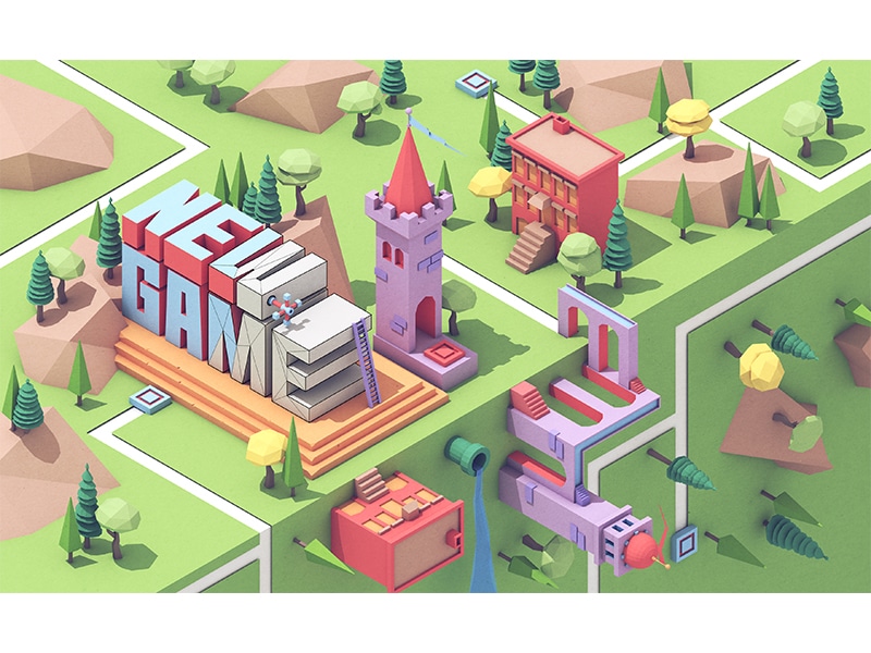
2. Isometric explainer videos as a big picture


Also known as “The Wolf in 3D Sheep’s Clothing”. This trend is particularly recommended so that the focus of your explainer video is on the whole. The isometric style makes it possible to depict complex structures and relationships from a bird’s eye view. No matter whether your explainer video depicts technical processes, architectural masterpieces or an entire world: By mapping two metric spaces on top of each other, you get distance and distance. Looks like a complex 3D animation but can be illustrated as 2D. So definitely our trend wolf in sheep’s clothing for 2019. A real eye-catcher together with strong color gradients.
3. Realistic shapes & proportions


Playful explainer videos with a cartoon look are a thing of the past. This year, those who keep up with the times create realistic, grown-up animations. Realistic animation? Exactly! This trend has what it says on the inside. The realistic depiction of proportions, truthful figures, buildings or objects gives your explainer video the portion of credibility to score points everywhere. The realistic illustration enables the viewer to identify with your explainer video. Individual illustrations for your company make it possible to play with a realistic animation almost in the real film team. Only simpler, cheaper, more individually designed and staged according to your corporate design.
4. Vintage with idyllic lighting
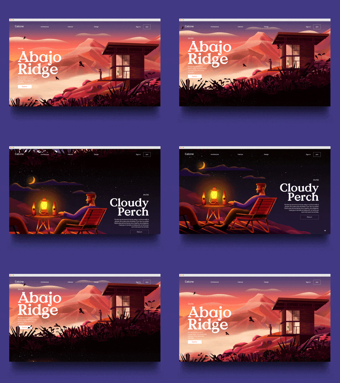
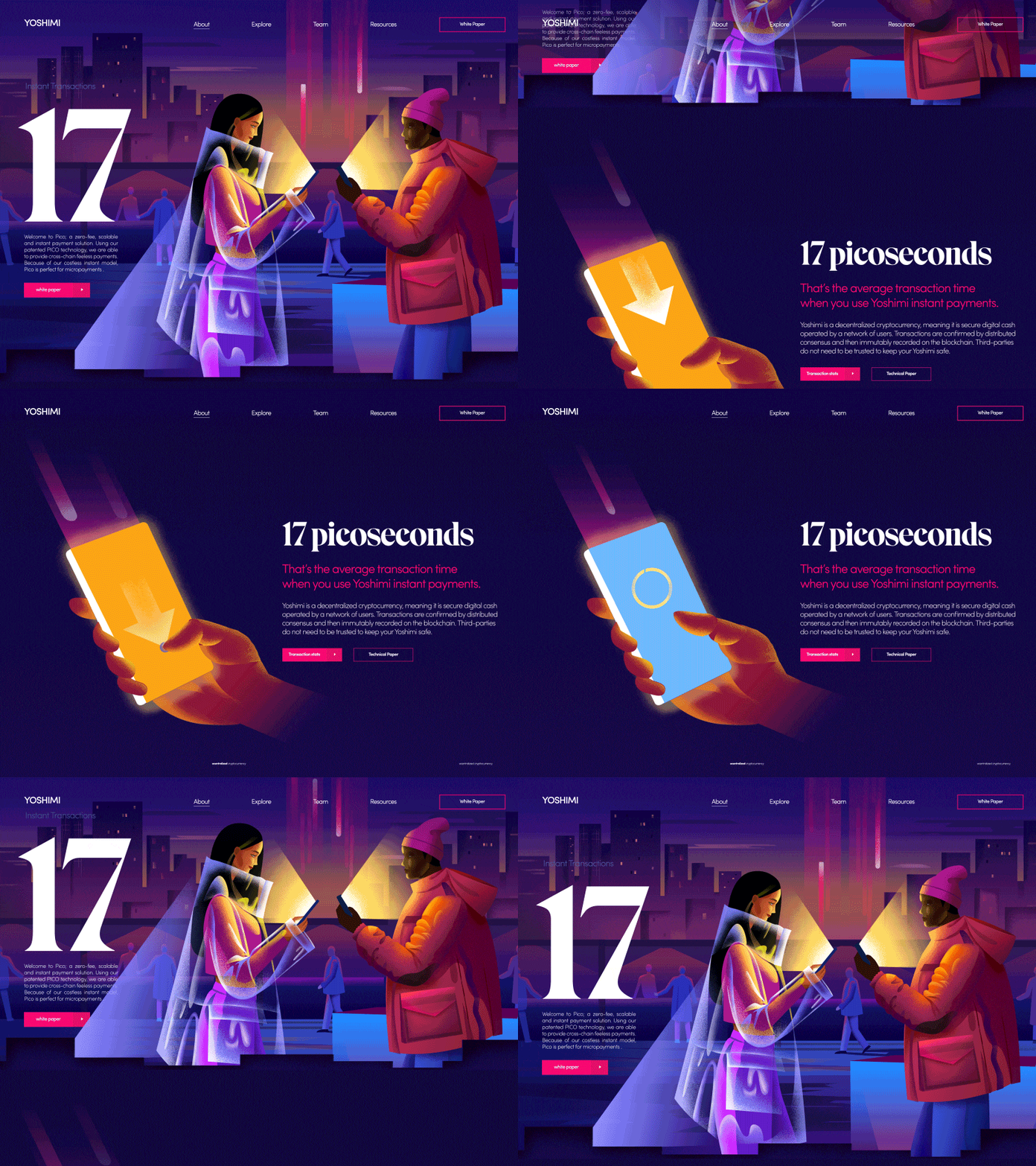
Heartwarming! With this style, your explainer video hits the mark – or, in other words, straight to the heart. Warm, calm, idyllic, harmonious colors give the explainer video the calm it needs to get to the heart of complex content. The grain effect and realistic textures create a modern vintage style. As well as the Instagram filter at the top, the explainer video with the grain effect is also very fashionable this year.
5. 3D videos for an all-round view


(3) Author: Jeremy Woons – Project : Executive Producer
If you at the 2. If you were disappointed with the “Isometry” trend, we can reassure you: This year, the trend towards real 3D videos will also play an important role. 3D illustrations give your explainer video a high degree of reality, are extremely entertaining and simply beautiful to look at. After all, we too see the world in 3D. With 3D animations, objects rotate around their own axis, giving an all-round view. Perfect for putting your product in the foreground and giving viewers a holistic insight. With 3D videos, nobody feels like you have something to hide anymore. With a simple 3D illustration, you give your image the necessary depth and realistic form that fully exploits the imagination of every viewer.
6. Information graphics: For cross-media use
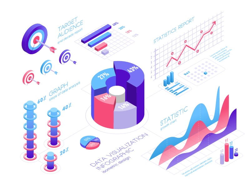
A 2-minute explainer video is too long? Want to reduce complex content to a single image? Here we go! With the trend of information graphics you achieve a large overall picture. Perfect for print media – A double page spread with appealing illustrations and meaningful text is not just flipped through. In online media, the infographic can also be animated interactively. This brings movement into the picture and thus conveying complex content in a simplified way is child’s play. Success guaranteed!


